
One of the most effective ways to elevate the visual appeal of your slides is by using dark mode PowerPoint templates. These templates offer a modern, professional appearance that’s easy on the eyes, particularly in low-light settings. Whether you're pitching a business proposal, teaching a class, or presenting at a conference, dark mode can help your slides stand out.
In this article, we’ll explore the best tips for using dark mode PowerPoint templates to create a sleek, polished presentation that engages your audience and enhances readability.
Why Choose Dark Mode PowerPoint Templates
Dark mode PowerPoint templates offer several benefits. First, they reduce eye strain, which is especially useful during lengthy presentations or in dimly lit rooms. Second, they help highlight bright text, graphics, and media. Lastly, dark backgrounds are often perceived as more elegant and professional, giving your presentation a sophisticated edge.
If you’re trying to leave a lasting impression, dark mode templates are a great choice. However, to maximize their impact, it’s important to apply a few design principles and best practices.
1. Choose the Right Font Colors
The key to an effective dark mode presentation lies in contrast. Since your background will be dark—ranging from deep gray to pitch black—you need to ensure your text stands out clearly. White is the most common font color used in dark mode templates, but it’s not your only option.
Try using off-whites, light grays, or subtle pastels to reduce eye fatigue and add visual interest. Avoid neon or oversaturated colors, as they can be jarring on a dark background. If you need to use color to convey meaning (such as red for errors or green for success), ensure those colors are bright enough to be seen but soft enough not to distract.
2. Use Clean and Minimal Typography
Dark mode PowerPoint templates look best when paired with clean, modern typography. Sans-serif fonts like Arial, Helvetica, or Montserrat work well because they are simple and legible even in small sizes.
Avoid decorative fonts or overly bold typefaces unless you’re using them for headers or emphasis. Keep your typography consistent throughout your slides—use one or two fonts at most, and maintain a hierarchy with different sizes or weights instead of changing fonts altogether.
3. Highlight Key Information with Accent Colors
One advantage of dark backgrounds is their ability to make accent colors pop. Use a consistent accent color to draw attention to important data, keywords, or calls to action.
Accent colors can be integrated into your headings, icons, bullet points, and charts. Just make sure they align with your branding or presentation tone. For instance, a corporate pitch deck might use a deep blue or gold accent, while a creative portfolio could include brighter hues like magenta or teal.
4. Choose High-Quality Images with Transparency
Images play a vital role in any presentation, and dark mode templates are no exception. For a sleek and cohesive look, choose images with dark or transparent backgrounds. PNG images with transparent backgrounds are ideal because they integrate seamlessly with your slide without harsh edges or white borders.
When using images with light backgrounds, consider adding a dark overlay or reducing their opacity. This creates contrast between the text and image, ensuring that neither element overshadows the other.
5. Simplify Charts and Graphs for Clarity
Charts and graphs should be easy to read in dark mode. Use light-colored lines and labels, and avoid gridlines unless they serve a clear purpose. For bar graphs or pie charts, select colors with enough brightness and contrast against the dark background.
Avoid overloading your slides with too many data points. Instead, focus on visual storytelling by using one chart per slide and highlighting key takeaways with color or animation.
6. Use Icons to Visualize Concepts
Icons are a powerful way to communicate ideas quickly. In dark mode PowerPoint templates, icons should be simple, flat, and preferably white or light gray. They help break up text-heavy slides and add a modern feel to your presentation.
Consider using icon libraries that match your template’s style. Ensure consistency by keeping icon size and color uniform across slides. When used effectively, icons can enhance comprehension and visual flow.
7. Limit the Use of Animation and Transitions
Dark mode presentations often feel more refined and professional. To maintain that tone, use animation and transitions sparingly. Subtle effects like fades or gentle slides are usually best.
Avoid flashy transitions like spins, zooms, or bounces unless you're presenting to a very informal audience or showcasing creative work. The goal is to let your content speak for itself, not to distract with excessive motion.
8. Design with Mobile and Remote Viewing in Mind
Many presentations today are shared via video calls, mobile devices, or cloud-based platforms. Dark mode PowerPoint templates translate well to screens, but it’s still important to test your slides on multiple devices.
Ensure that text remains legible and that visuals are high-resolution. Avoid overcrowding slides—remote viewers may be watching on smaller screens, and too much content can become difficult to follow. Stick to one idea per slide and use plenty of spacing to guide the viewer’s eye.
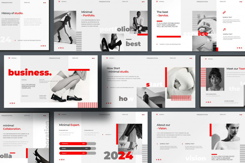
9. Match Your Presentation Style with the Right Template
Not all dark mode templates are created equal. Some are minimalist, while others offer creative or corporate aesthetics. Choose a template that matches your presentation goals.
If you're giving a business pitch, opt for templates with clean lines, professional fonts, and subtle color accents. For a tech demo, you might choose a futuristic dark mode template with neon accents. Creative professionals can experiment with bolder layouts or artistic visuals. The key is consistency—your template should reflect your tone and message from start to finish.
10. Customize the Master Slides
Most PowerPoint templates come with master slides—pre-formatted layouts that control the look and feel of your presentation. Don’t hesitate to customize them. Adjust fonts, colors, and placeholders to better fit your brand or preferences.
Setting up your master slides early on ensures that your design remains consistent throughout your presentation. It also saves time and helps avoid formatting errors that can occur when designing each slide individually.
11. Keep Slide Layouts Consistent
Dark mode templates can look disorganized if you constantly change layout styles. Stick to a few core layouts—such as title slides, content slides, image-and-text combos, and data slides—and reuse them across your presentation.
Consistency in layout reinforces your message and helps the audience navigate your content with ease. A sleek presentation isn’t just about looking good; it’s about delivering information clearly and confidently.
12. Use Contrast-Optimized Backgrounds
A dark background doesn’t have to be pure black. Deep navy, charcoal, or gradient shades offer visual interest without compromising readability. Some dark mode templates include subtle textures or patterns that add depth without becoming distracting.
Experiment with background shades and gradients, but always test how your text and visuals appear against them. Remember, the goal is to maintain clarity and contrast.
13. Test for Accessibility
Dark mode PowerPoint templates must also be accessible to all viewers, including those with visual impairments. Use accessible color combinations that meet contrast standards and avoid red-green pairings for colorblind viewers.
You can check accessibility directly in PowerPoint using the built-in accessibility checker. If your presentation is meant for wide distribution, this step is essential to ensure inclusivity.
14. Avoid Clutter at All Costs
Sleek design is minimal design. Resist the urge to fill every inch of your slides with content. Instead, give your content room to breathe. Use negative space to your advantage—it helps focus attention on key elements and prevents visual overload.
If you have multiple points to make, spread them across several slides instead of crowding one. This not only improves aesthetics but also enhances comprehension and pacing.
15. Save as a Template for Future Use
Once you’ve customized a dark mode presentation to your liking, save it as a PowerPoint template. This allows you to reuse your design framework for future presentations without starting from scratch.
By creating your own library of PowerPoint templates, you can maintain brand consistency and streamline your workflow. Over time, having a few go-to dark mode templates on hand will save time and elevate your presentations.
Final Thoughts
Dark mode PowerPoint templates offer a bold and modern alternative to traditional light backgrounds. They enhance focus, improve readability, and create an elegant visual experience—when used correctly. By following these tips, you can ensure your presentation looks sleek, professional, and audience-friendly.
From selecting the right fonts and colors to maintaining consistent layouts and contrast, every detail plays a role in creating an effective dark mode presentation. Whether you're a seasoned presenter or just getting started, embracing these design principles will help you make the most of your PowerPoint templates and deliver a powerful message with confidence.
Comments
0 comment